Jivana
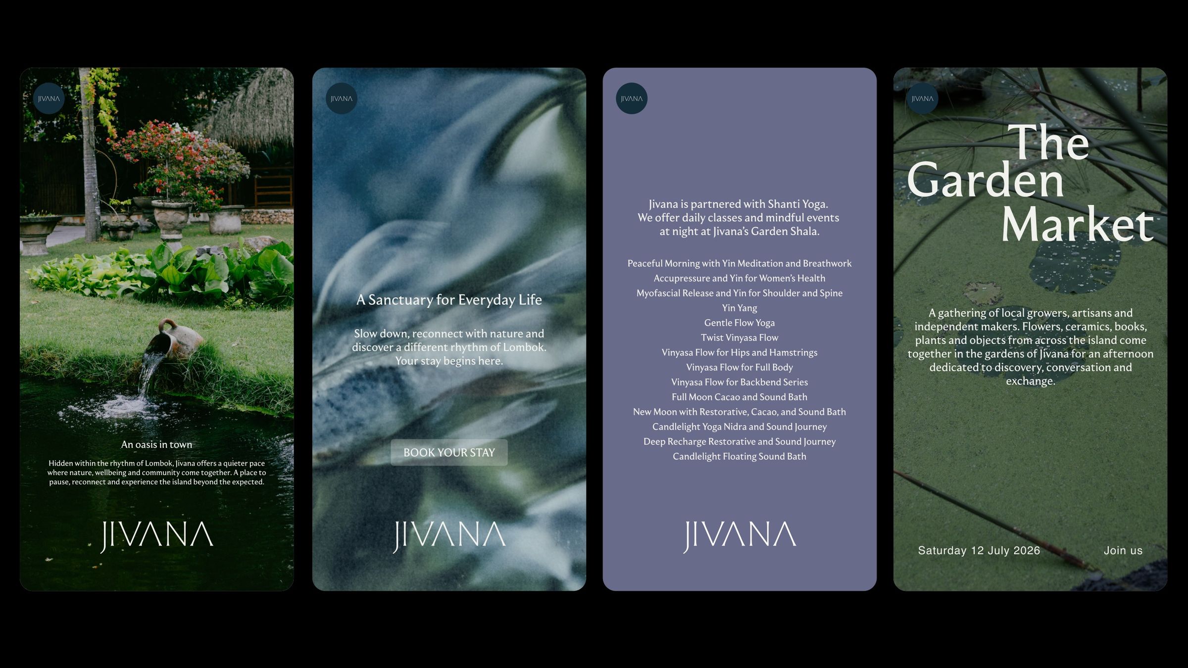
Brand strategy and visual identity for Jivana, a resort in Kuta, Lombok. An identity built on four elements, water, air, earth and fire, each with its own symbol and colour, carried from the printed matter to film.

The client
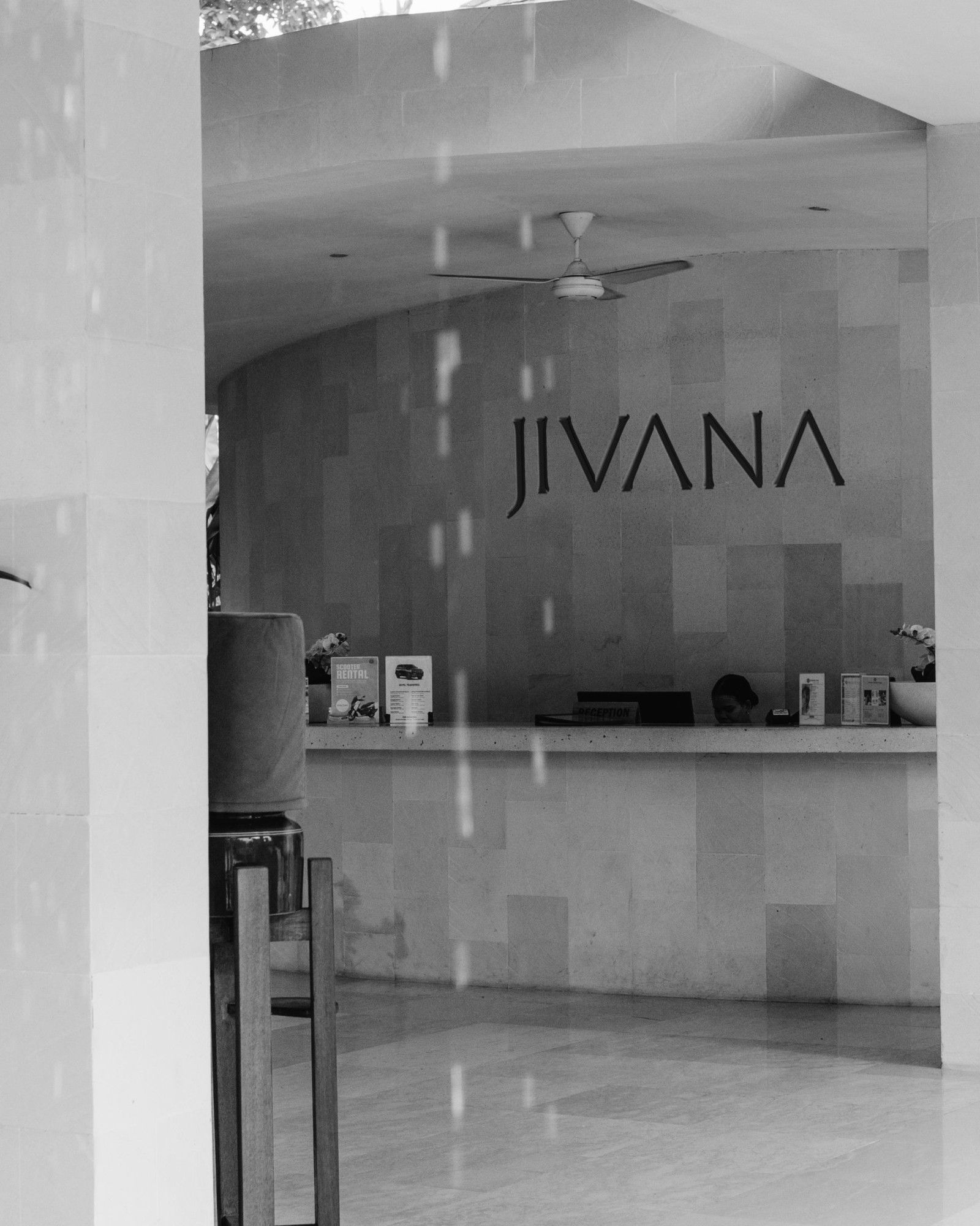
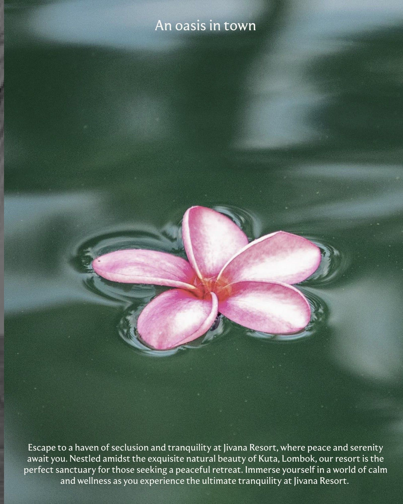
Jivana is a resort in Kuta, on the south coast of Lombok, Indonesia: villas set among gardens, pools and koi ponds, with a spa and animals that wander the grounds.
The brief
Jivana already had an atmosphere of its own and guests who come back. It needed a strategy and an identity that put that feeling into words and images, and set it apart from the standardised villa look spreading across Lombok.
What we did
Strategy. In working sessions with the team we defined what Jivana stands for and organised the experience around four elements, water, air, earth and fire, that shape the day from morning to night.
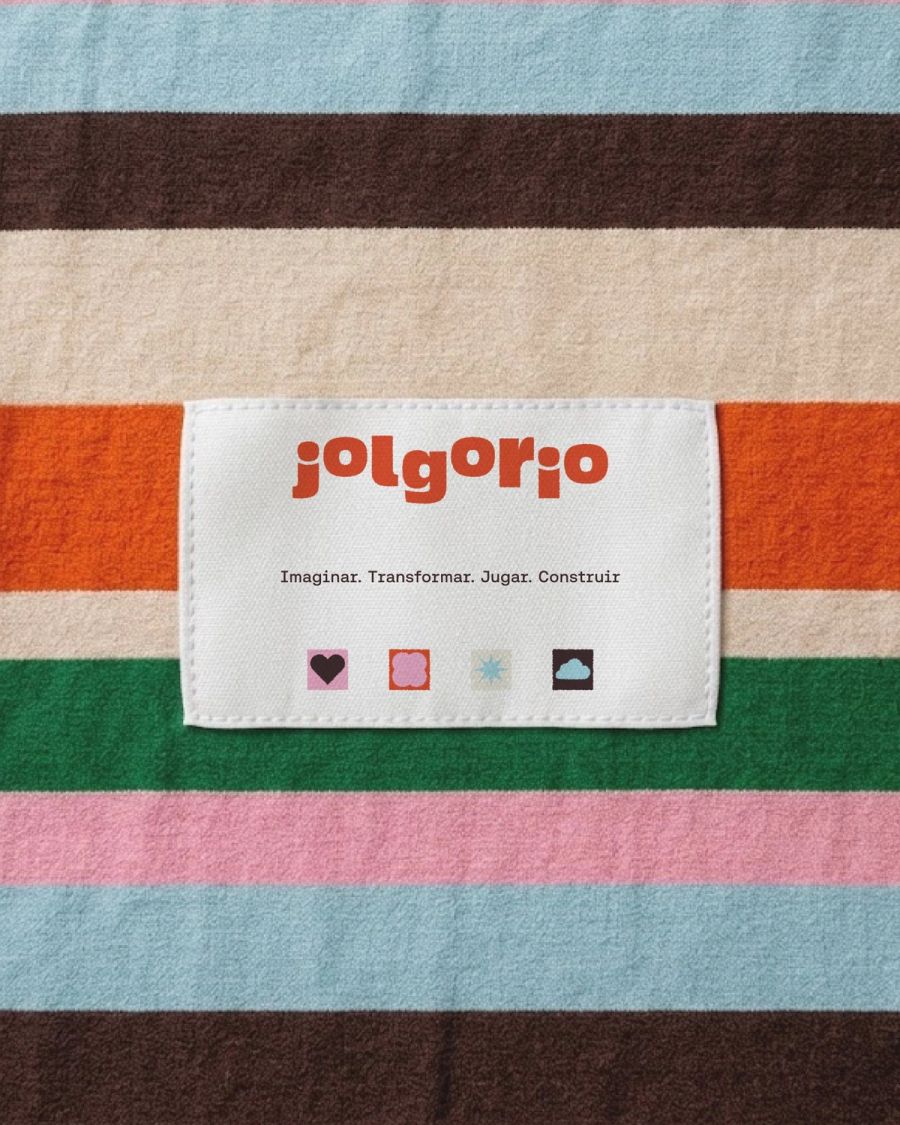
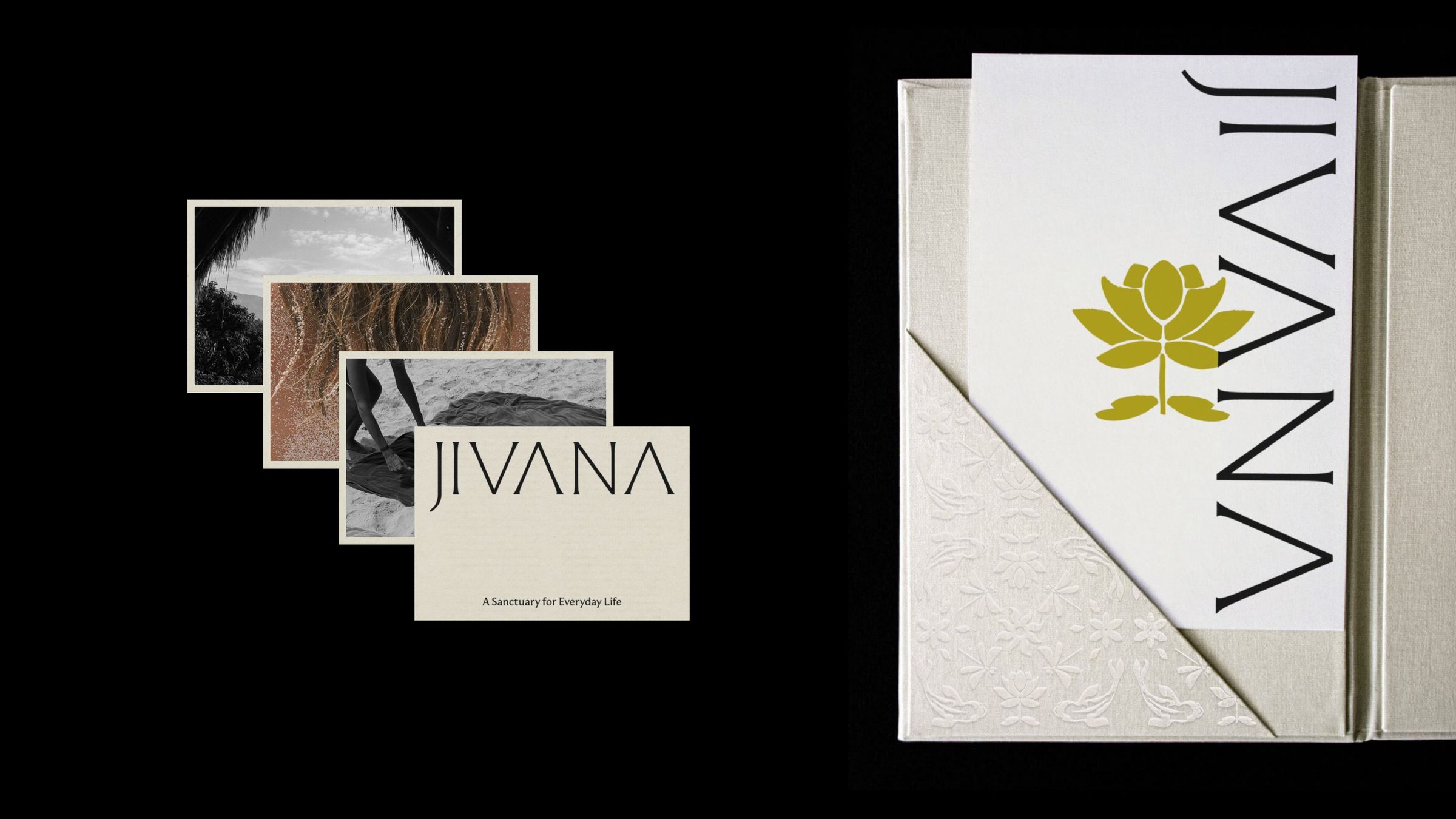
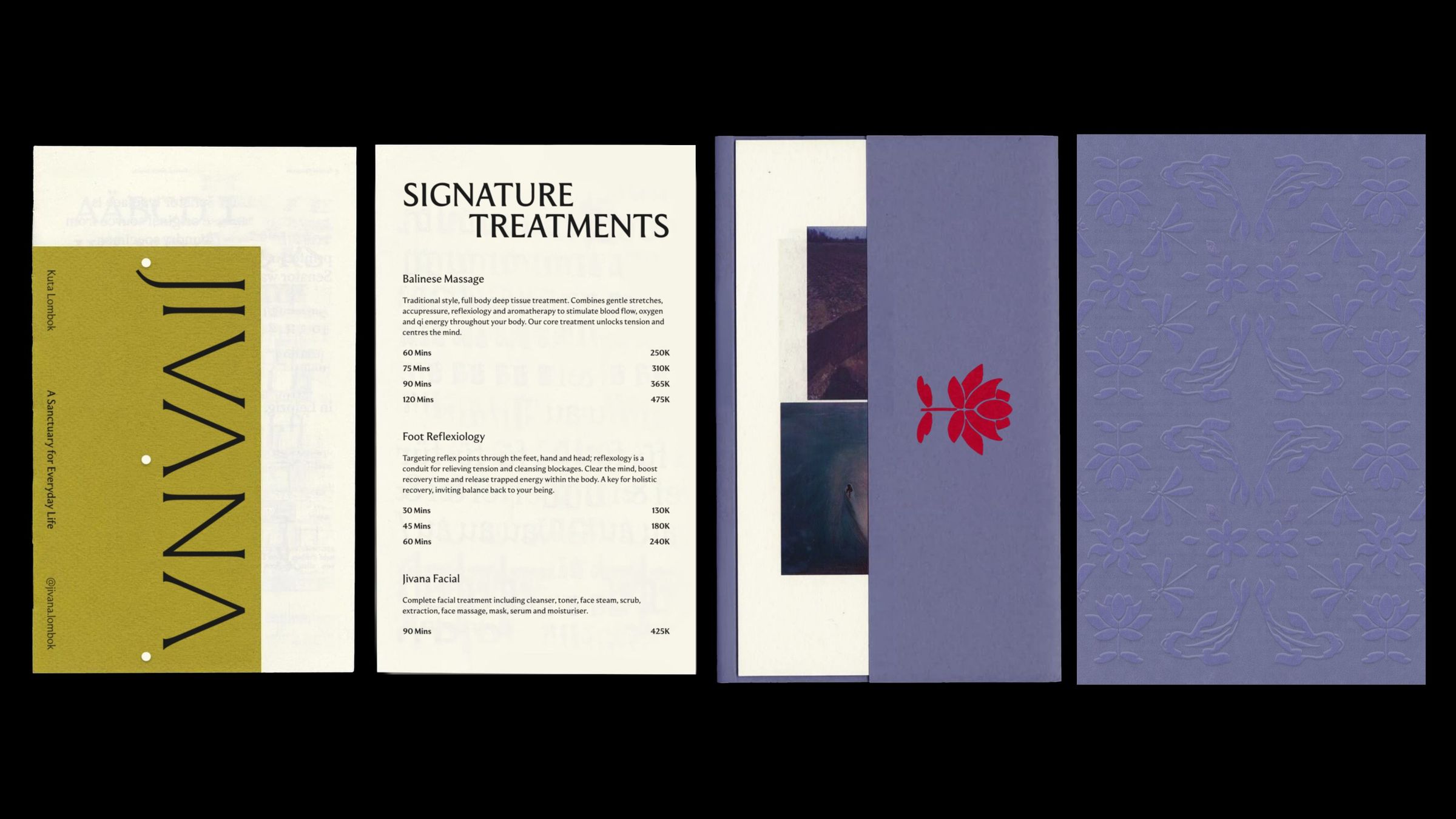
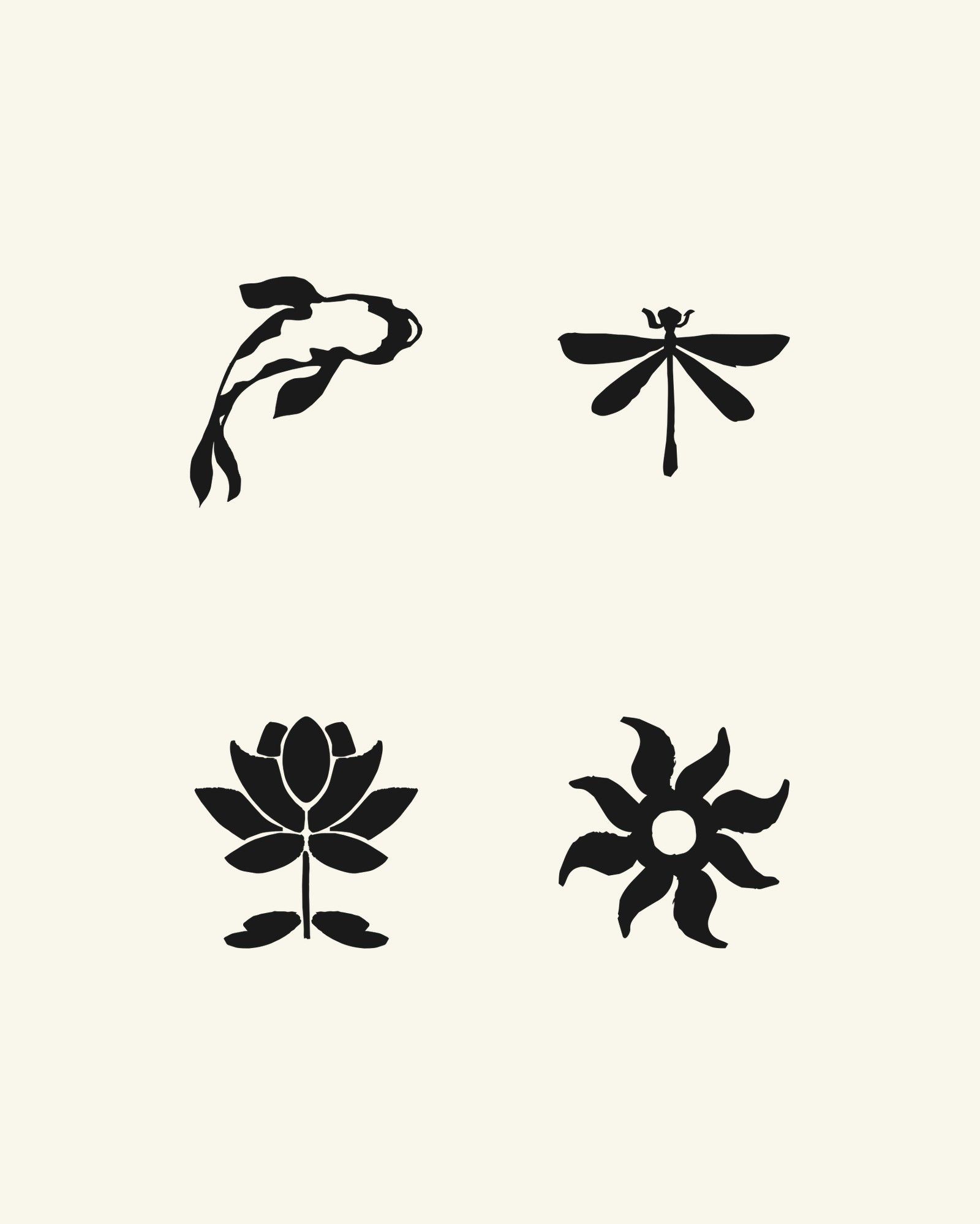
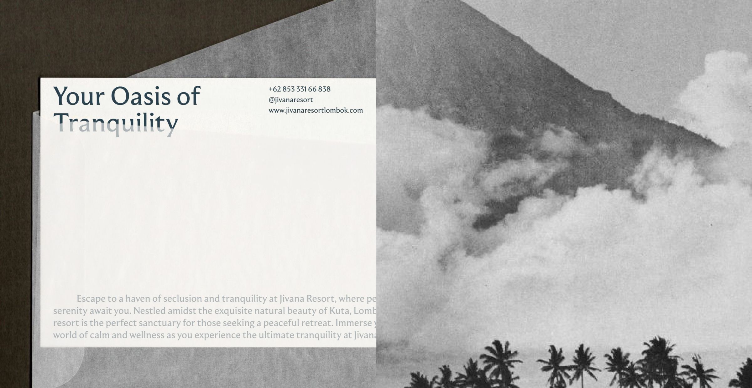
Branding. We designed the wordmark, a symbol for each element (koi, dragonfly, lotus and sun), a colour palette named after them, the typography, a pattern and the art direction, and applied them to stationery, menus, signage and social media.
Content. We made short films around the four elements, one of them built entirely from generated imagery.